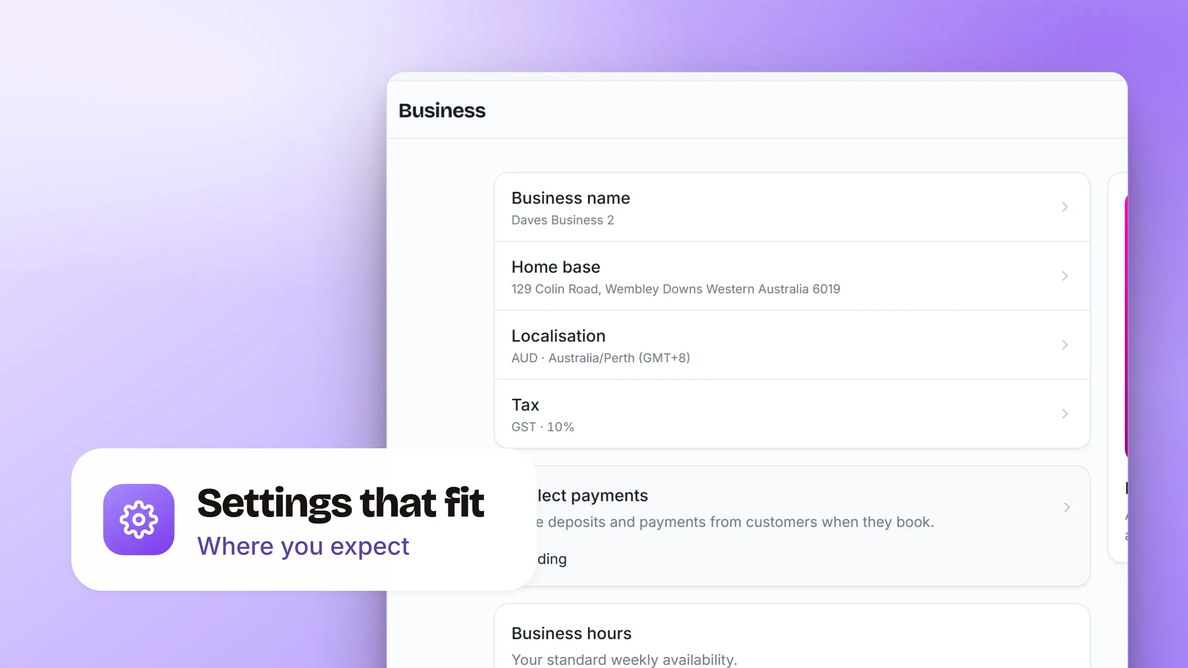
We took a pass over Settings so the whole area feels like one place, not a pile of screens:
- Everything about a service lives on the service. Coverage areas, hours and territories now sit on the bookable editor, next to the service they belong to, instead of being scattered across separate pages.
- Grouped by what you're doing. Payments and notifications are gathered under Operations, so the day-to-day admin is together and the list is shorter to scan.
- A cleaner billing view. Your wallet, activity, invoices and usage got reworked, with a friendlier empty state when there's nothing to show yet.
- Add-ons explained better. Each add-on now opens a detail view that tells you what it does before you turn it on, and the cards read more clearly at a glance.